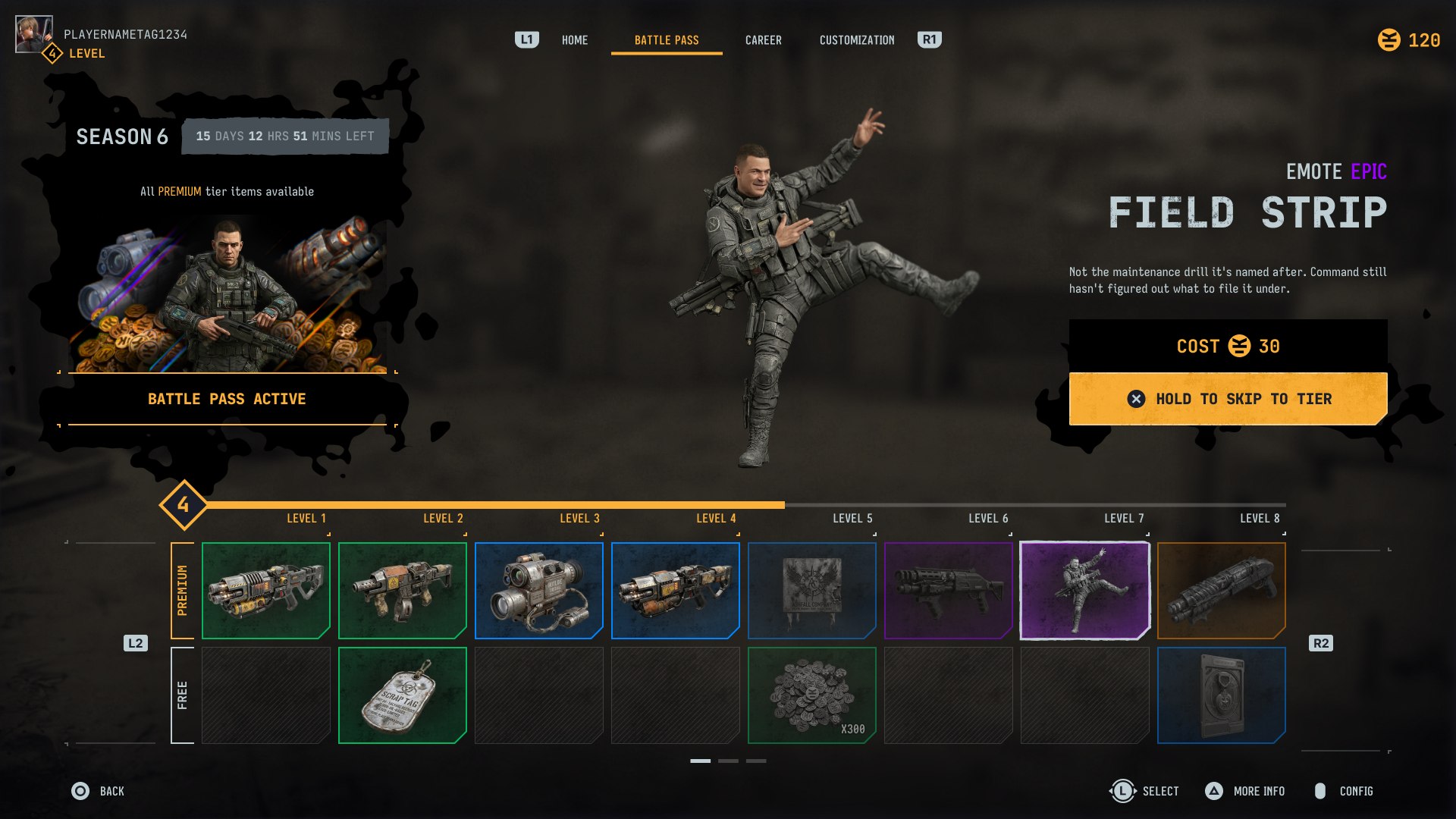
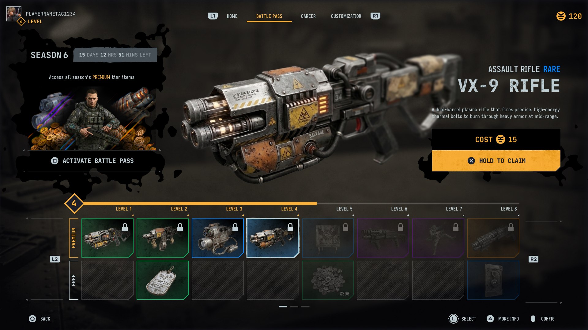
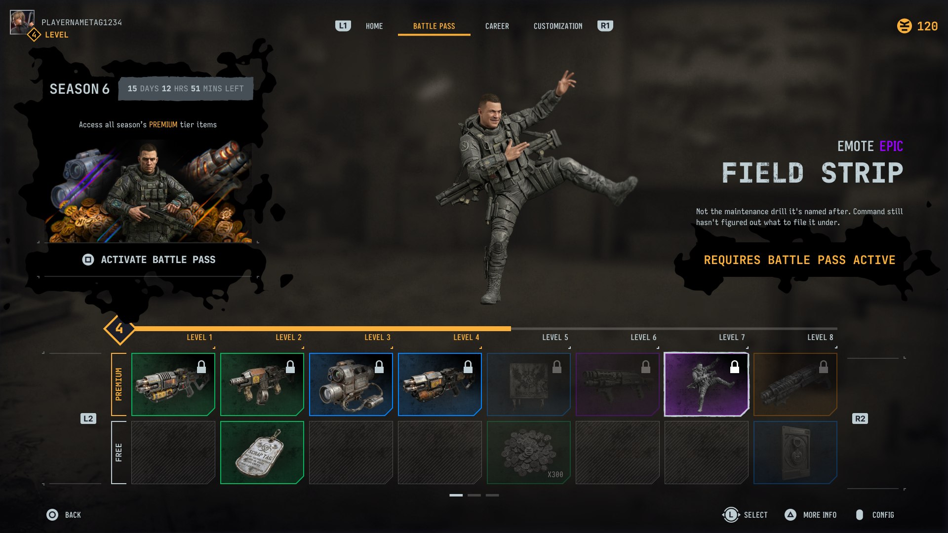
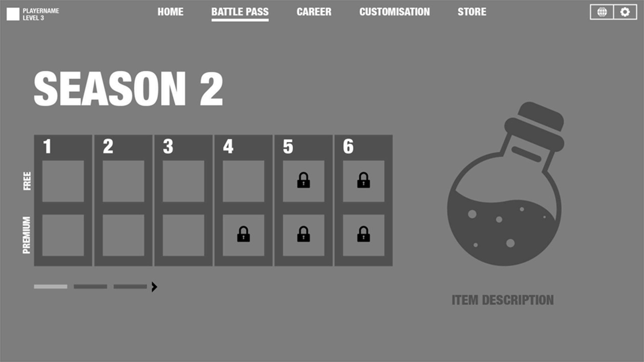
The brief: propose a battle pass for a new AAA RPG on PS5, built in Unreal Engine 5, starting from a rough grey-box wireframe with a six-tier free/premium track and a handful of locked slots. The art direction was left open on purpose — "tactical, authentic, and gritty," a grounded military look balanced against sleek high-tech HUD elements — with full freedom to rebuild the layout rather than just skin what was handed over.
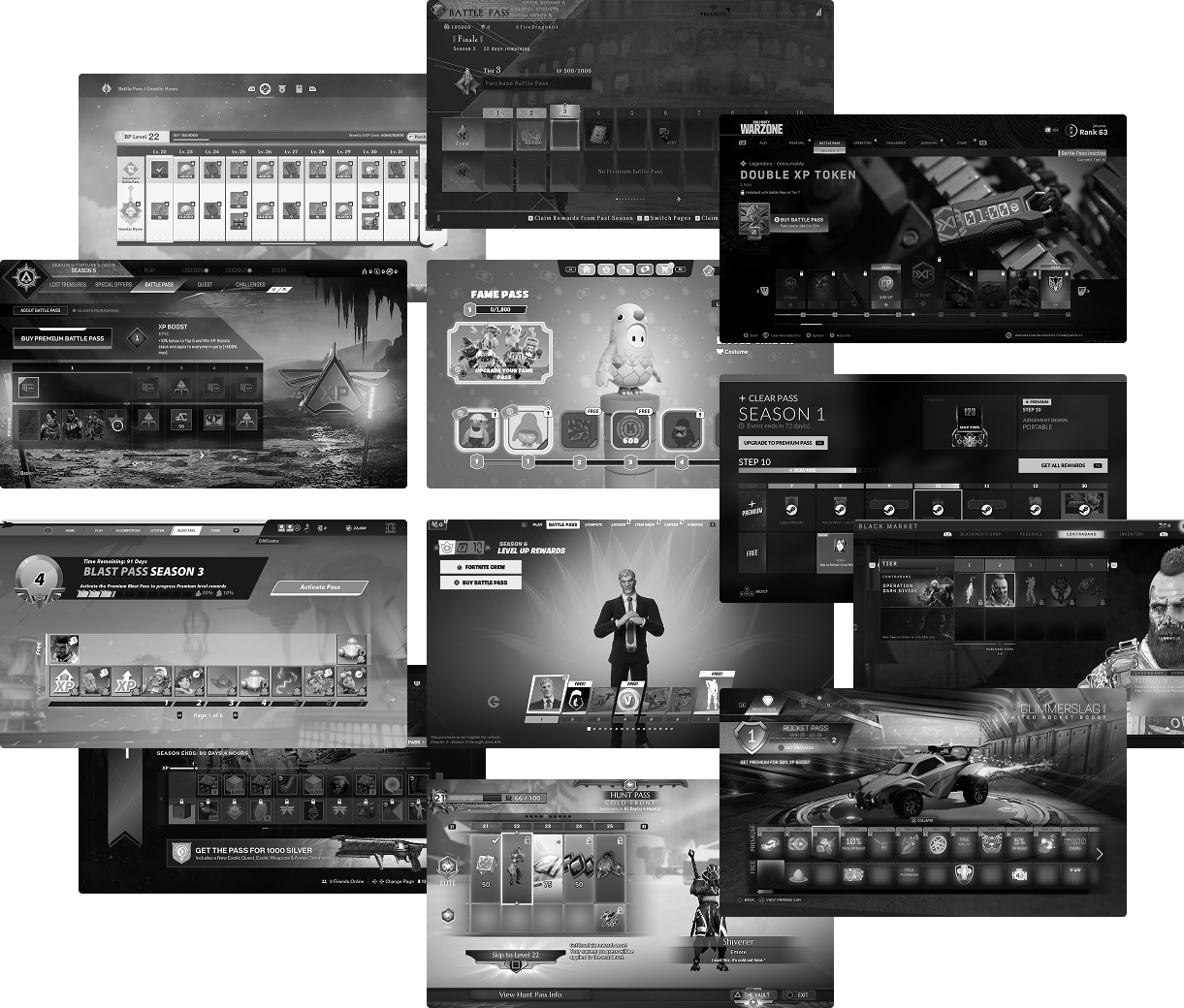
Before opening Figma, I audited battle pass UIs across a dozen live-service and AAA titles — Fortnite, Genshin Impact, Apex Legends, Call of Duty: Warzone, Dauntless, Destiny 2, Rocket Pass, and Fall Guys among them — to map the shared architecture behind these screens and see where genre changes the approach. Three patterns held up across almost all of them: two dominant free/premium structures (a parallel dual-rail track vs. a single rail with lock overlays), two dominant compositions (menu-left/ hero-right vs. hero-top/rail-bottom), and "breathing room" that comes from contrast — a dense reward rail set against an open hero-preview zone — rather than uniform whitespace. Those three findings shaped every layout and interaction decision that followed.
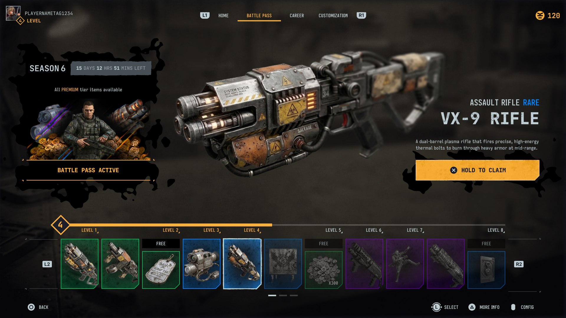
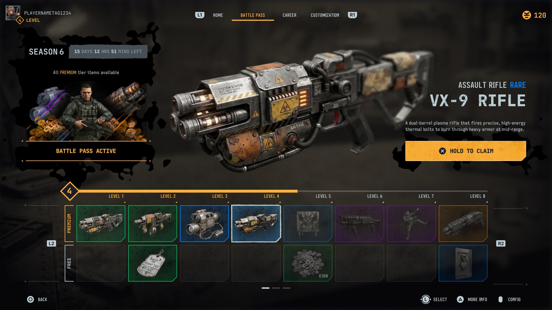
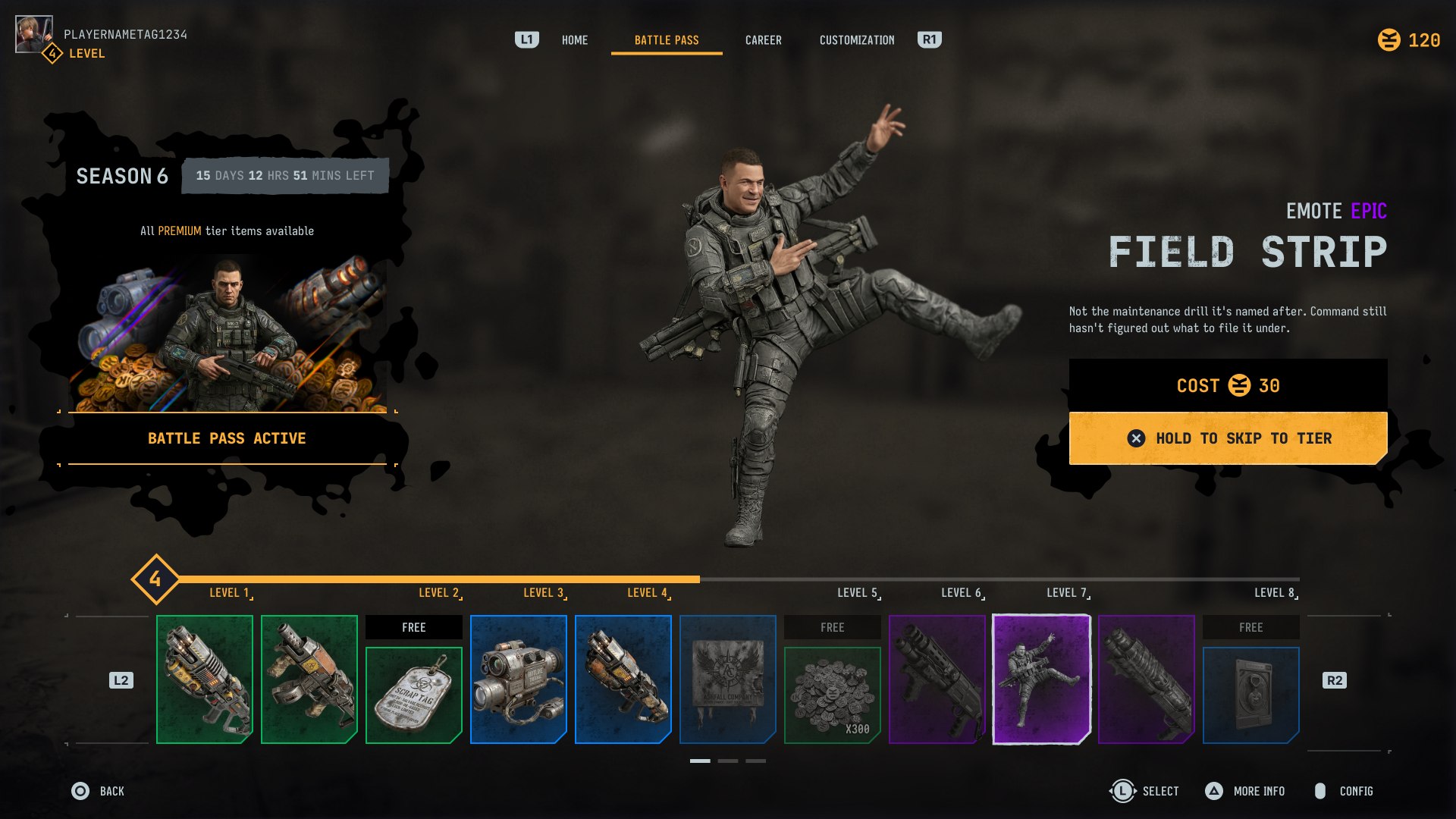
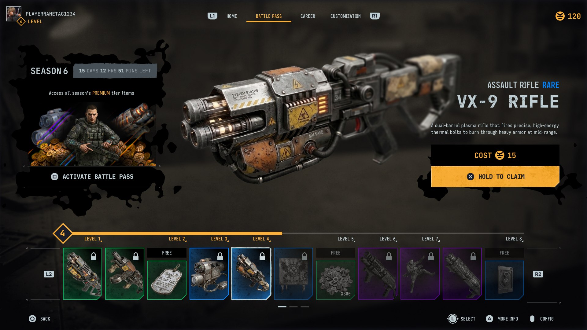
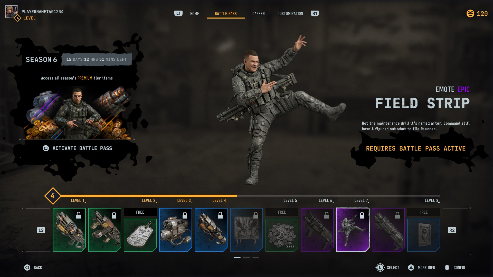
Rather than commit to one reward-track structure early, I carried both finalist directions from the research all the way through to finished screens. Dual-row stacks free and premium rewards in parallel per tier — the strongest "here's what you're missing" signal, at the cost of vertical space and some repeated reward art. Single-row collapses that into one rail with individual "FREE" tags called out on their own, which reads calmer and frees up room for a larger hero preview, but leans harder on that preview to sell the value gap. Drag below to compare them side by side on the same state.
Dual-row
Single-row
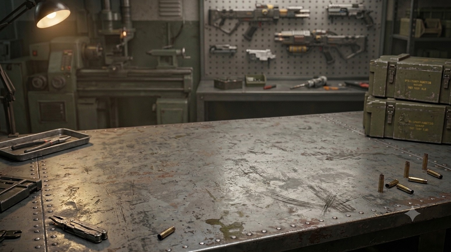
A grounded, tactical direction built from three pillars rather than picked screen-by-screen. Type: Iosevka Charon carries headlines, item names, navigation, and body copy — its slab-technical character reads as engineered rather than decorative, and stays legible at small UI sizes. JetBrains Mono handles anything numeric — the season timer, currency counts, tier numbers, costs — so digits don't jitter as they update and read like a system readout rather than typography for its own sake. Color: a desaturated gunmetal/concrete base with a single warm amber accent carrying every interactive or "hot" state, so the eye never has to guess what's clickable. Texture: a gritty concrete surface plus a scorched, map-like silhouette used as a recurring graphic device behind key art — the same shape doing double duty as brand mark and background noise. One small world-building touch went into the reward art itself: an invented in-universe insignia, Ashfall Company, stamped onto one of the premium unlocks, just to sell the fiction a little further.
Both layout directions were carried through the same four-state logic, since a battle pass screen has to answer two independent questions at once: has the player bought the pass, and is the item they're looking at one they can claim right now, or one still locked ahead of their level? That gives four combinations — pass owned or not, crossed with item ready or not — each with its own CTA: Hold to Claim when it's theirs, Hold to Skip to Tier when it's a locked future reward they can buy their way to, Activate Battle Pass when they haven't bought in yet but the item is within reach, and a plain Requires Battle Pass Active notice when neither condition is met.
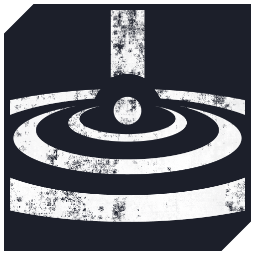
A late addition to the brief: a set of three player-ability icons, flat and single-color, carrying the same identity as the screens above. Each one needs to read clearly at a small hotbar size before any color or animation gets layered on top.
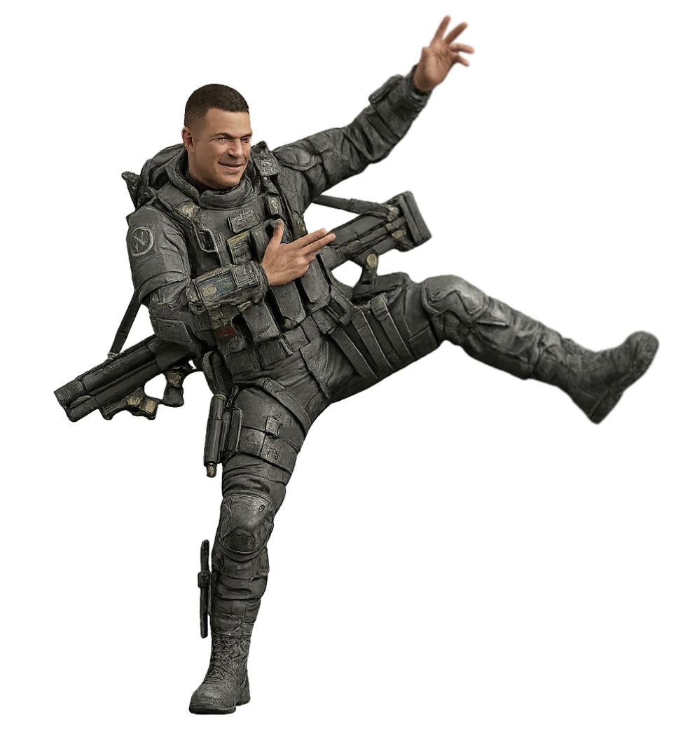
Built almost entirely in Figma — layout, components, prototyping, icons, and the presentation deck itself — with Affinity for some image touch-up. In line with the exercise's own guidelines on AI use: the weapon model, background plate, and operator character renders were AI-assisted (Nano Banana and ChatGPT), which the brief explicitly allowed for background art, characters, and visual effects. Every piece of the actual interface — layout, typography, iconography, color, and composition — was designed and built by hand.
The brief was deliberately open-ended — a rough wireframe and a mood in a sentence, little else to go on. Instead of guessing at a single "right" layout, I treated the ambiguity as the actual exercise: research the genre's conventions first, carry two real layout directions all the way to finished screens instead of one, and build a small type/color/texture system before touching final pixels — so every screen, and the four-state CTA logic behind it, reads as one coherent product rather than a set of mockups.