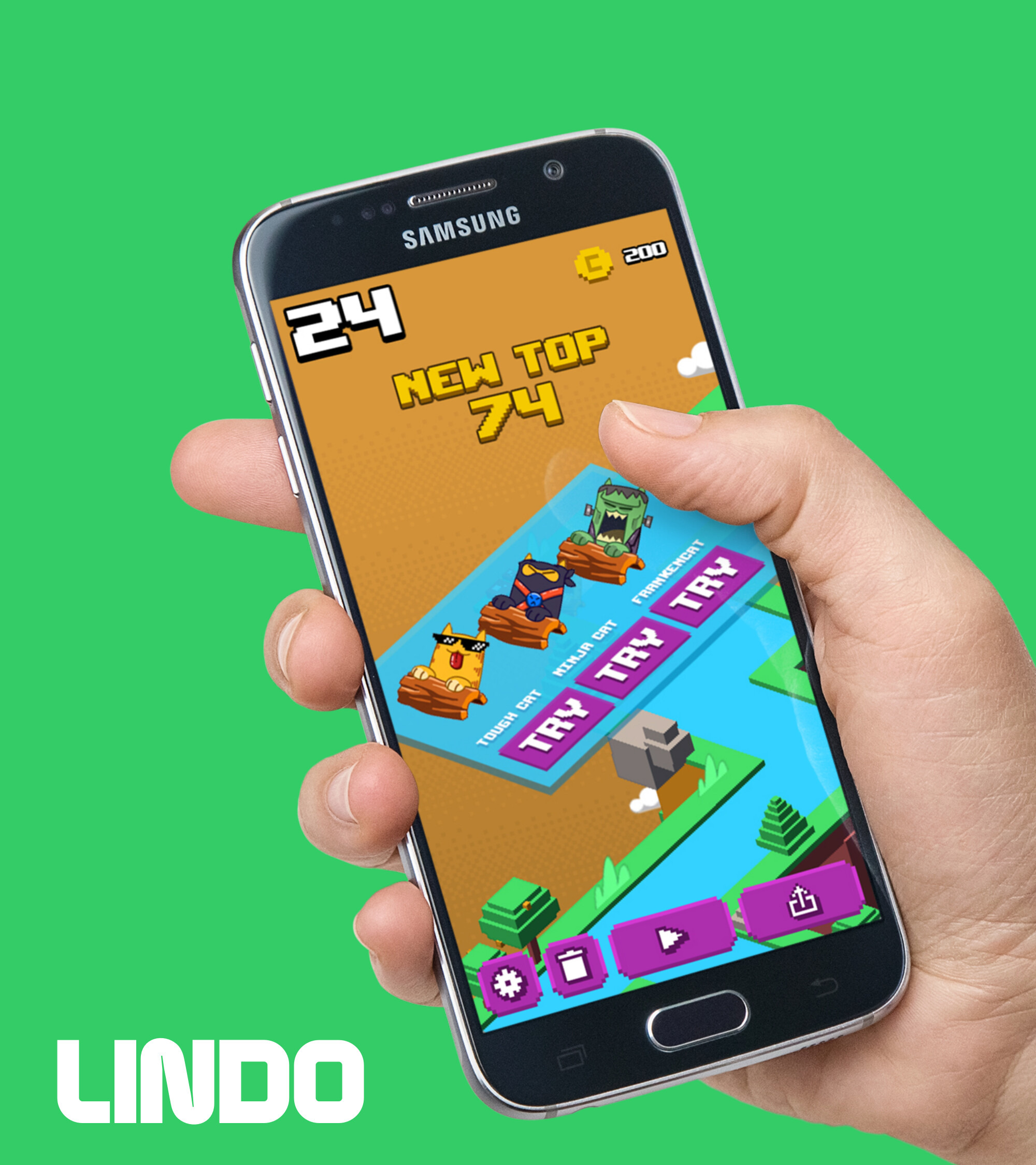
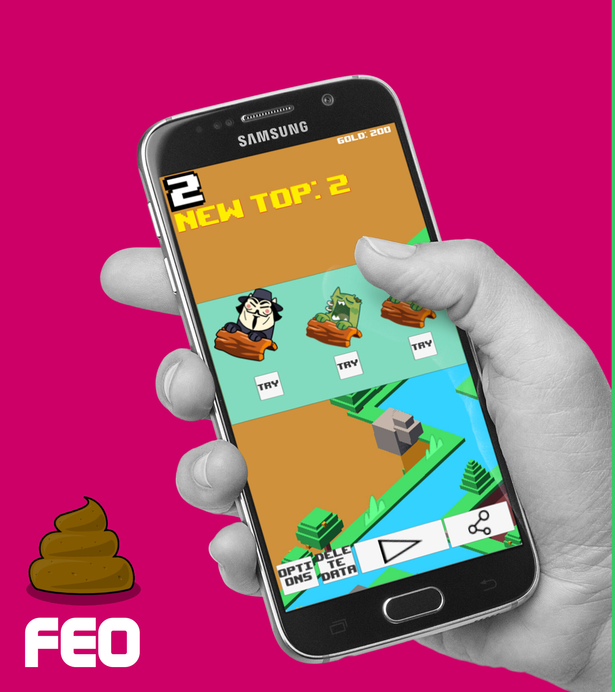
Before a single production asset got built, the visual direction had to be sold internally. Rather than argue in the abstract, I built side-by-side comparison decks — an intentionally rough "before" next to the proposed "after" — for the three places a player spends the most time staring at UI: picking a character, reading the HUD, and buying something in the store.
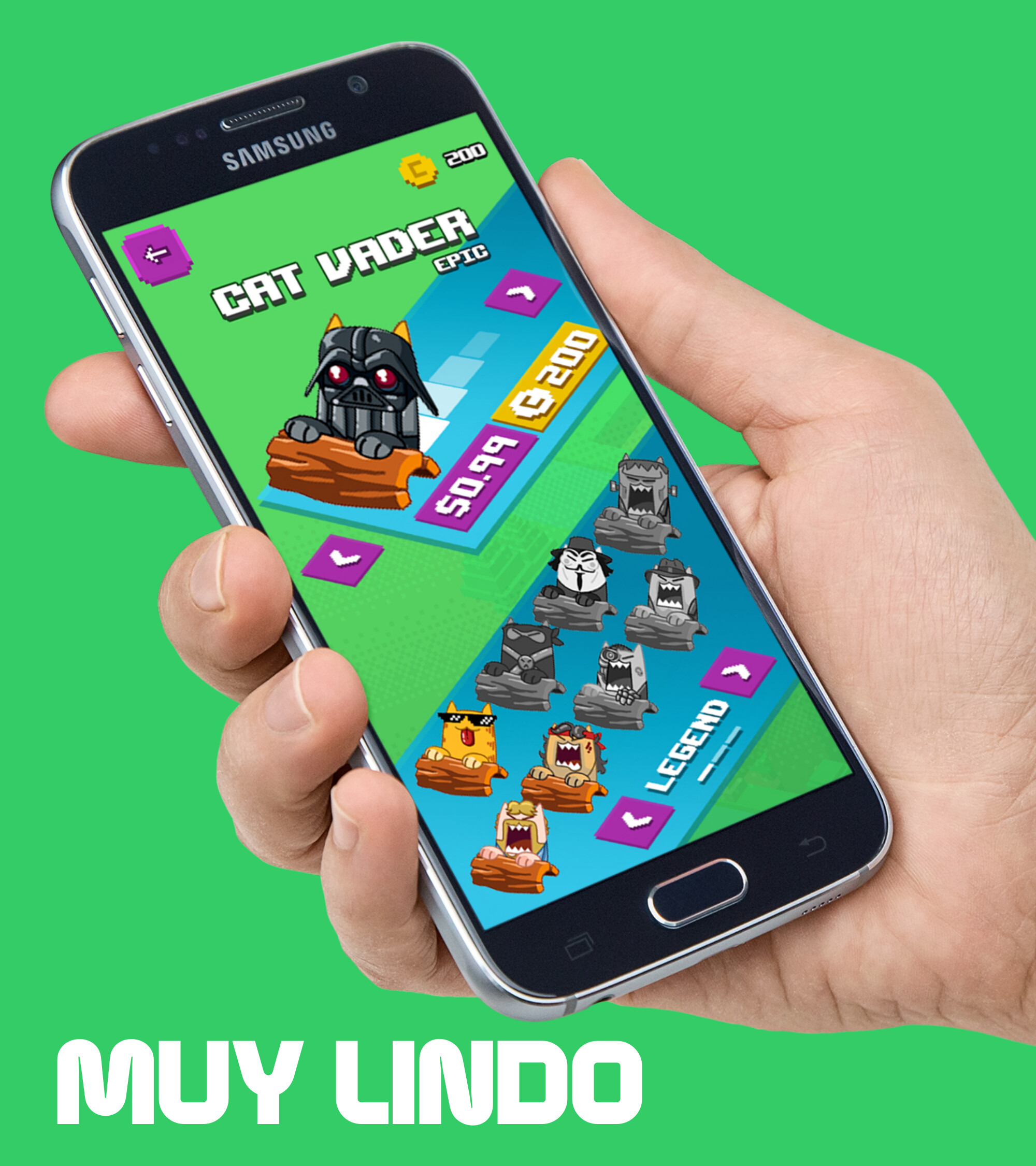
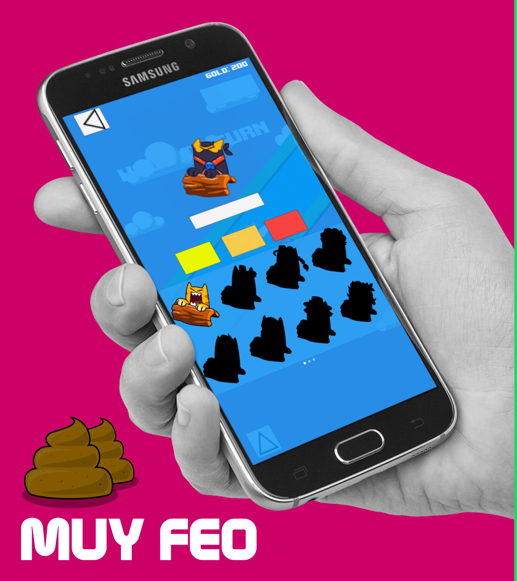
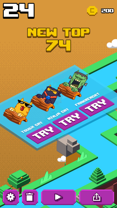
The pitch deck called it "Feo vs. Lindo" — ugly vs. cute. Same layout, same silhouettes standing in for locked characters, same "New Top" score banner. The only thing that changes is whether the cats look like something worth unlocking.
Before
After
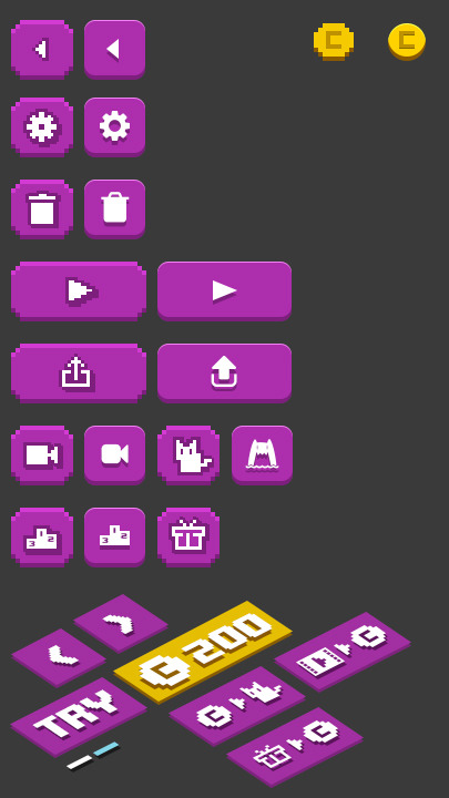
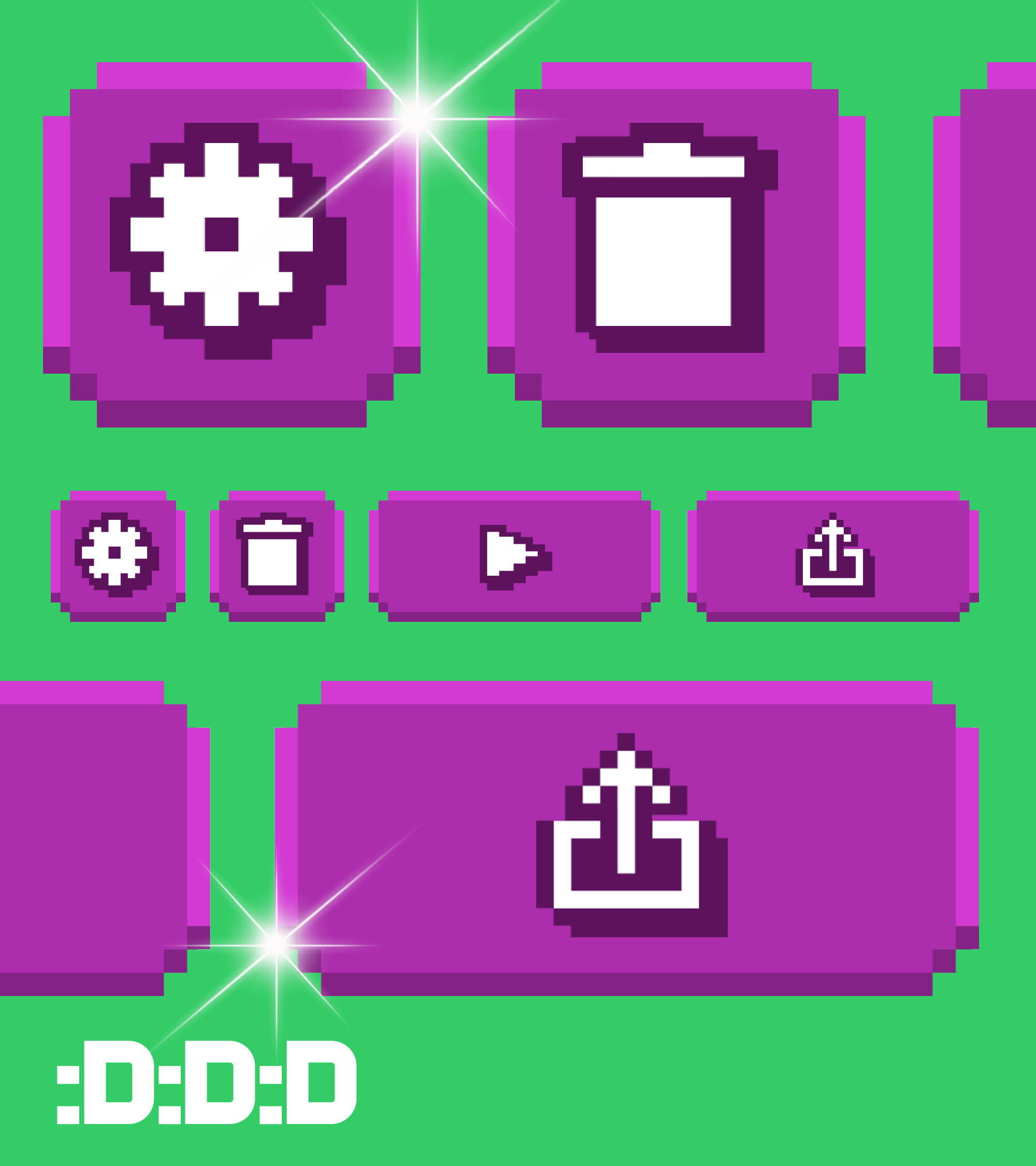
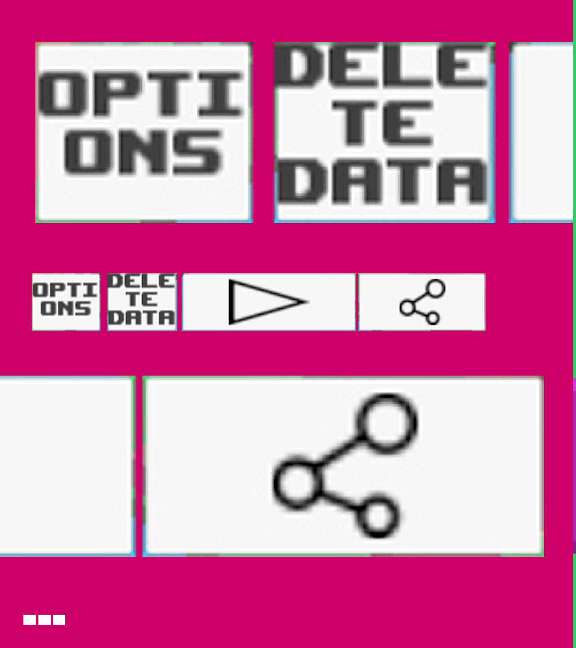
The baseline icon set was placeholder text in boxes — functional, forgettable. The proposal swapped it for a single pixel-art icon language (along with the optional non-pixelated version too) shared across every button in the game: settings, delete, play, share, record, and rate, all reading at a glance.
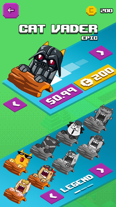
Same argument, applied to the item the store is actually trying to sell. Silhouettes and flat swatches don't move a $0.99 purchase; a character in mid-roar with a price tag and a legend row of who's already unlocked might.
Before
After
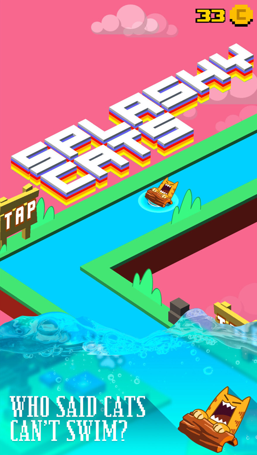
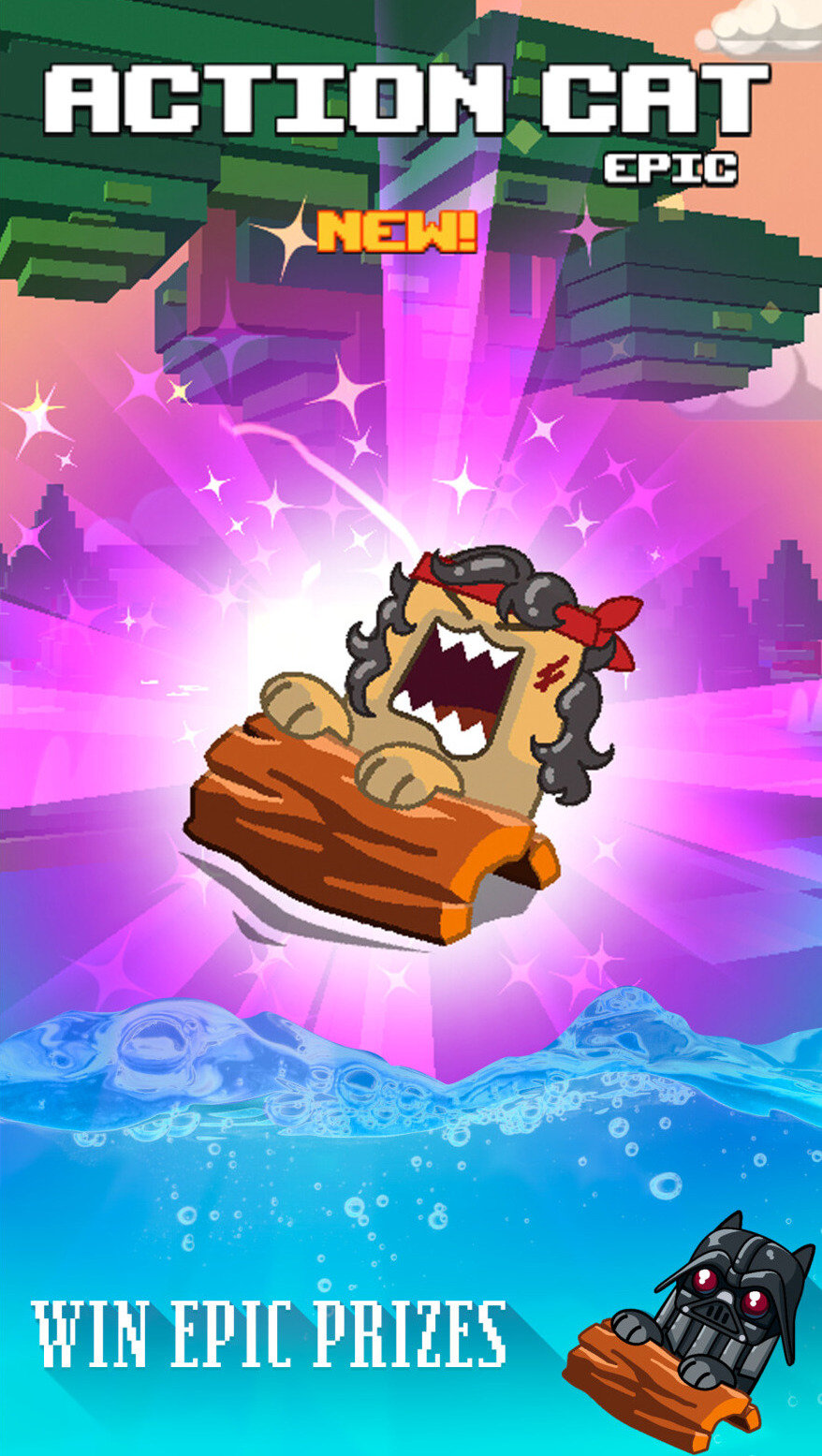
A few of the screenshots built for the App Store page, each one leading with a single clear promise: swim, collect, or spend.
Not every design argument needs a mood board. Framing the pitch as three concrete before/after screens — the exact screens the team would ship — made the direction easy to approve and easy to hold everyone to later.