tato.

Tato-002 · Case Study · Multiplayer RPG · 2025

Designing the systems layer
of Big Time

A full UI system for Big Time, a multiplayer online RPG. This is just a small sample of the full project.

Role: UI/UX Designer Tool: Figma Tool: Unreal Engine Year: 2025
↓ Begin the tour
—

Overview

Big Time is a multiplayer online RPG built around a story of time travel and historical figures. Its core hook is the Pocketwatch — a wearable item that fully swaps your class — and every cosmetic you earn is tradeable on the Openloot platform, so your loot is truly yours. The challenge was building an interface that could make all interconnected systems feel instinctive rather than overwhelming. Huge shout-out to Florencia Sanchez — her research and sharp calls on the tough decisions shaped a lot of what's here.

I.

HUD

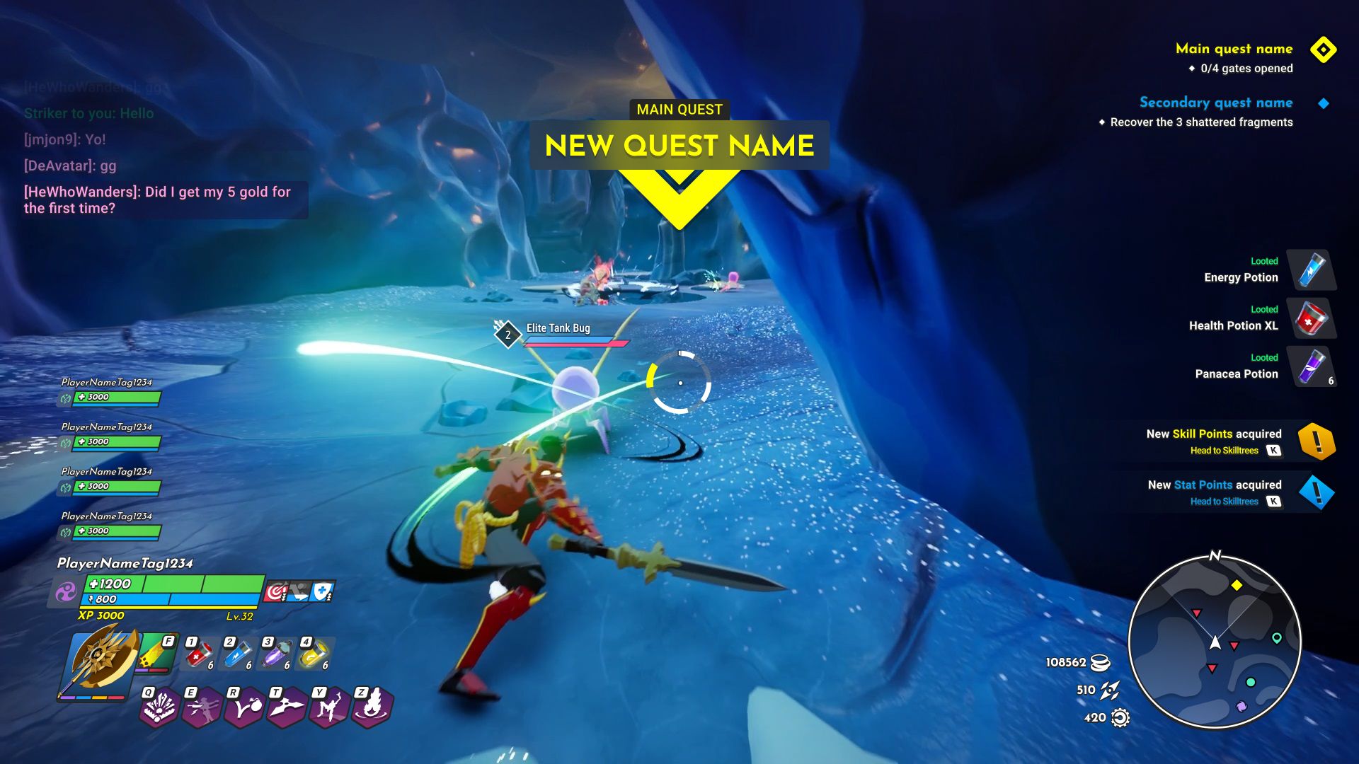
The Simple HUD is what you start the game with — chat, player health bars and XP, weapon swap, consumables stash, hotbar, quest tracker, map, and currencies. The Full HUD layers everything else on top: party UI, center-screen messages, Combo UI, notifications, item pickups, and ailments/buffs sitting right next to health, along with the enemy's health bars. Together, the two versions show the best-case and worst-case density a player will ever see on screen.
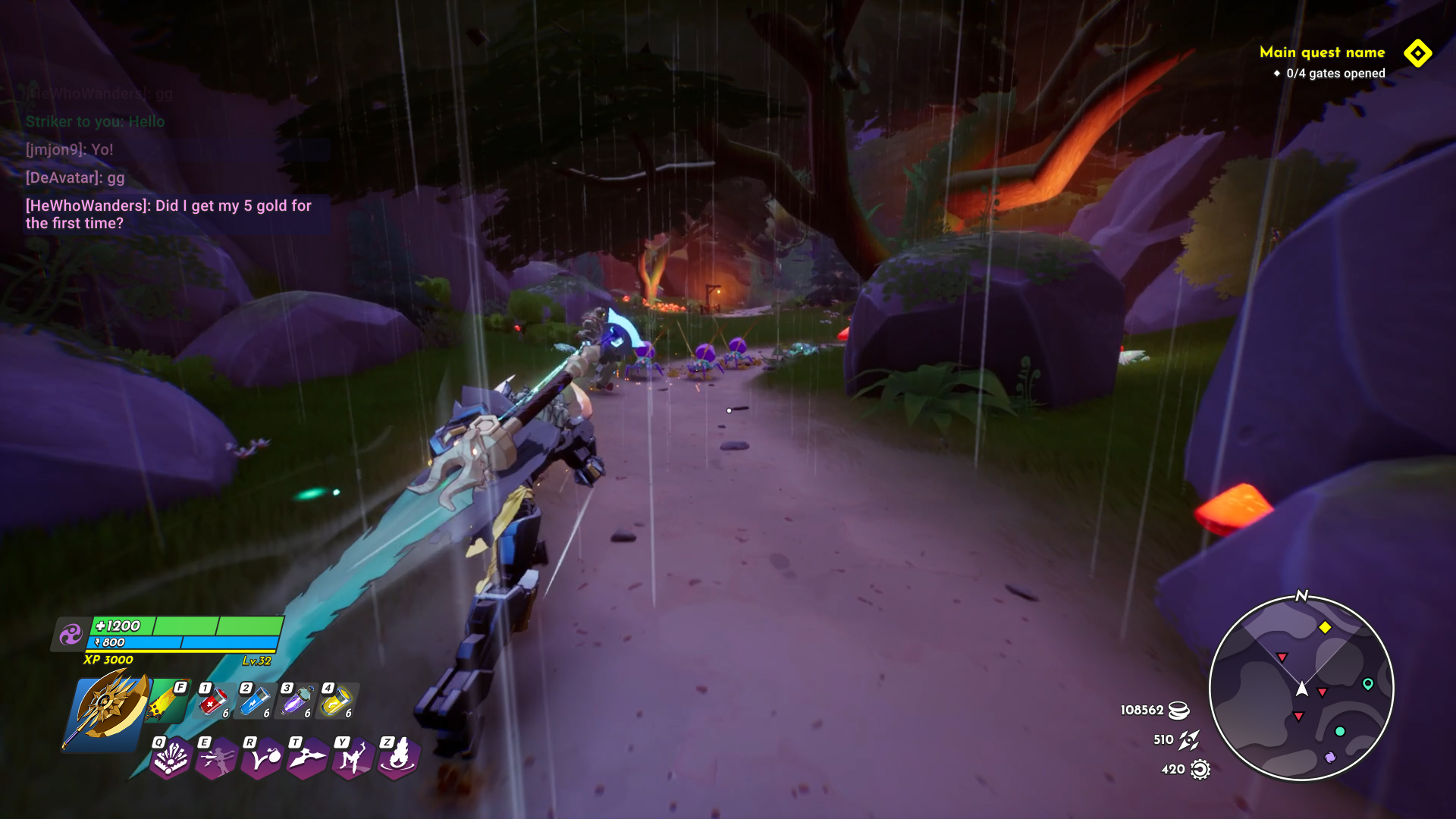
Simple HUD with chat, health, weapon swap, consumables, hotbar, quest tracker, map, and currencies
Simple HUDWhat you start the game with: chat, health and XP, weapon swap, consumables stash, hotbar, quest tracker, map, and currencies.
Full HUD with party UI, notifications, item pickups, combo UI, and enemy health bars
Full HUDEverything layered on top of Simple: party UI, center-screen messages, Combo UI, notifications, item pickups, ailments/buffs, and enemy health bars.
Full HUD with party UI, notifications, item pickups, combo UI, and enemy health bars Simple HUD with chat, health, weapon swap, consumables, hotbar, quest tracker, map, and currencies Simple Full
II.

Inventory & Equipment

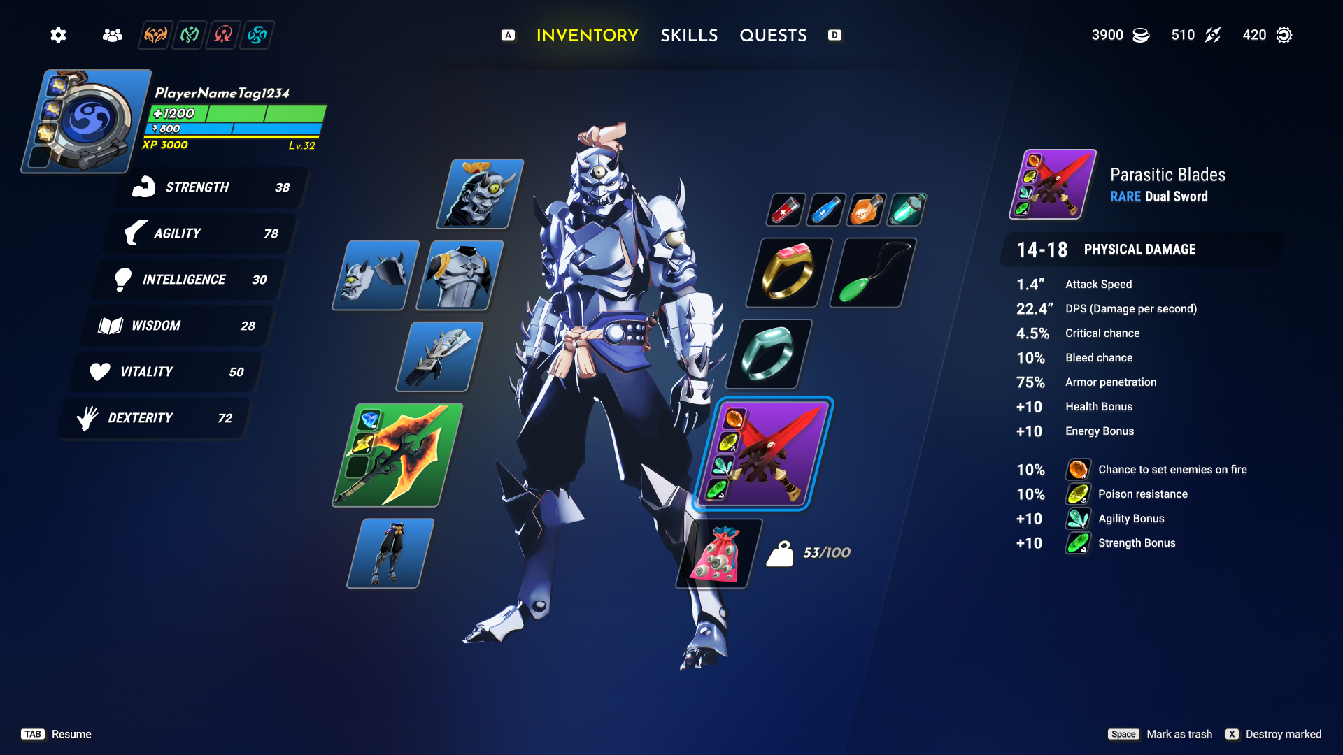
Every equipment slot follows the same three-column pattern: browse on the left, compare stats in the middle, see what's currently equipped on the right. Rarity is color-coded consistently (common white, uncommon green, rare blue, epic purple, legendary orange) across every screen in the system, so a player can price an item at a glance before ever opening the details.

Main character equipment screen with stat panel and equipped item slots
Character overviewCore stats on the left, full equipment loadout on the character model, selected item detail on the right.
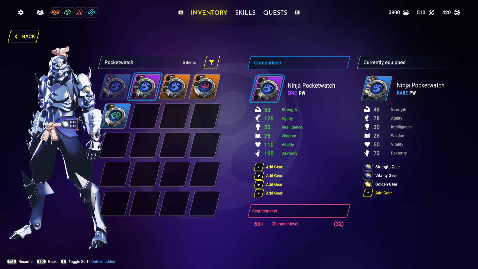
Pocketwatch selection
Pocketwatch selection screen comparing an equipped rare watch to an epic alternative
Pocketwatch selectYour choice of watch determines your class, giving you the flexibility to play exactly how you want or fill whatever role your party needs.
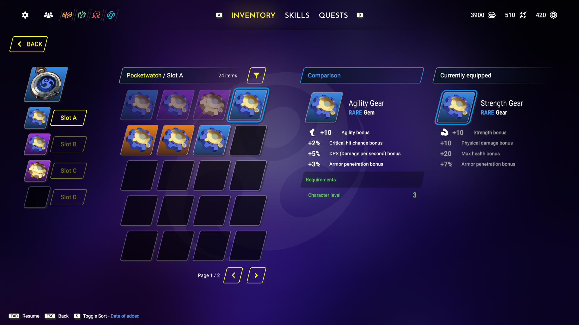
Pocketwatch gear socketing screen with four slot loadout
Pocketwatch slotsPocketwatch Gears are a type of in-game item that can provide various benefits to the player's character.
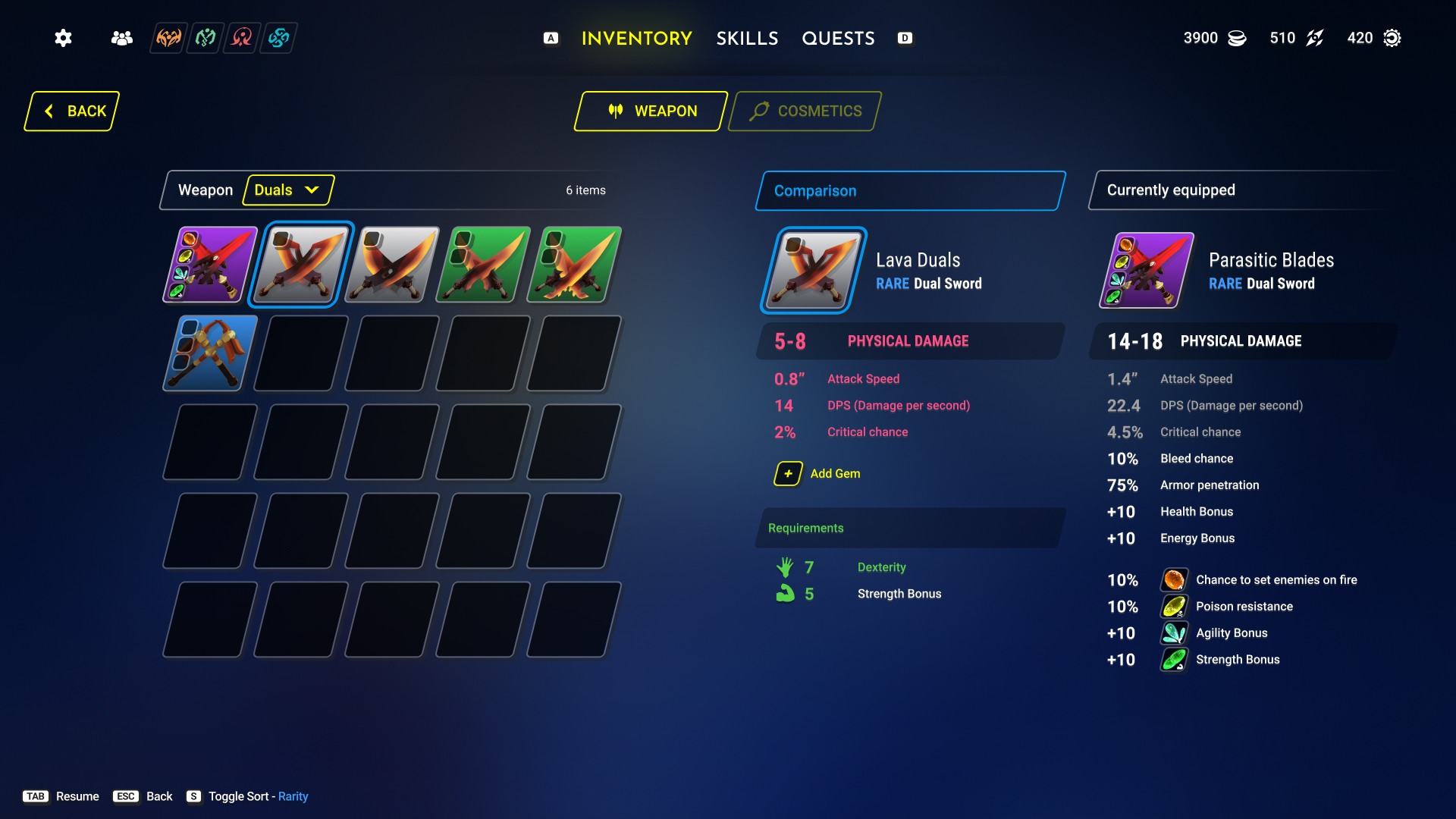
Weapons
Weapon selection filtered to dual swords
WeaponsFilterable by weapon type, with the same compare/equip pattern used everywhere else.
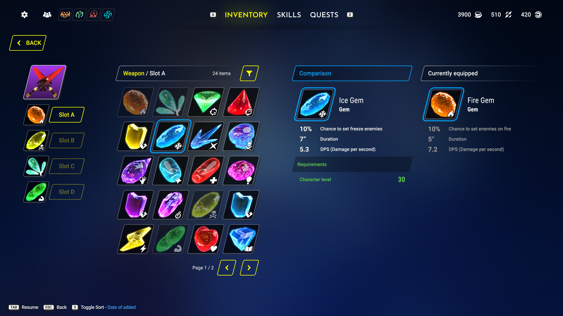
Weapon gem socketing screen comparing an Ice Gem to an equipped Fire Gem
Weapon slotsElemental socketing for weapons — same interaction pattern as Pocketwatch slots, reinforcing that "socket an item" means one thing everywhere in the game.
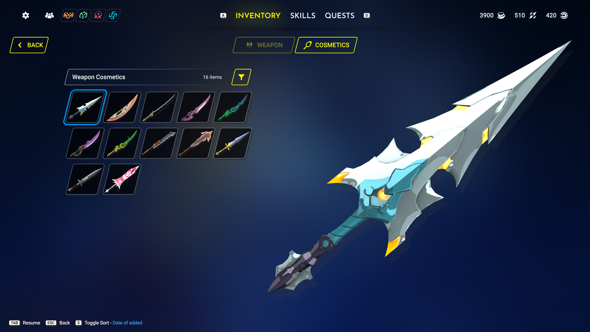
Weapon cosmetics grid with large weapon preview
Weapon cosmeticsCosmetics separated from functional gear entirely, with a large preview so the choice is visual first.
Other gear
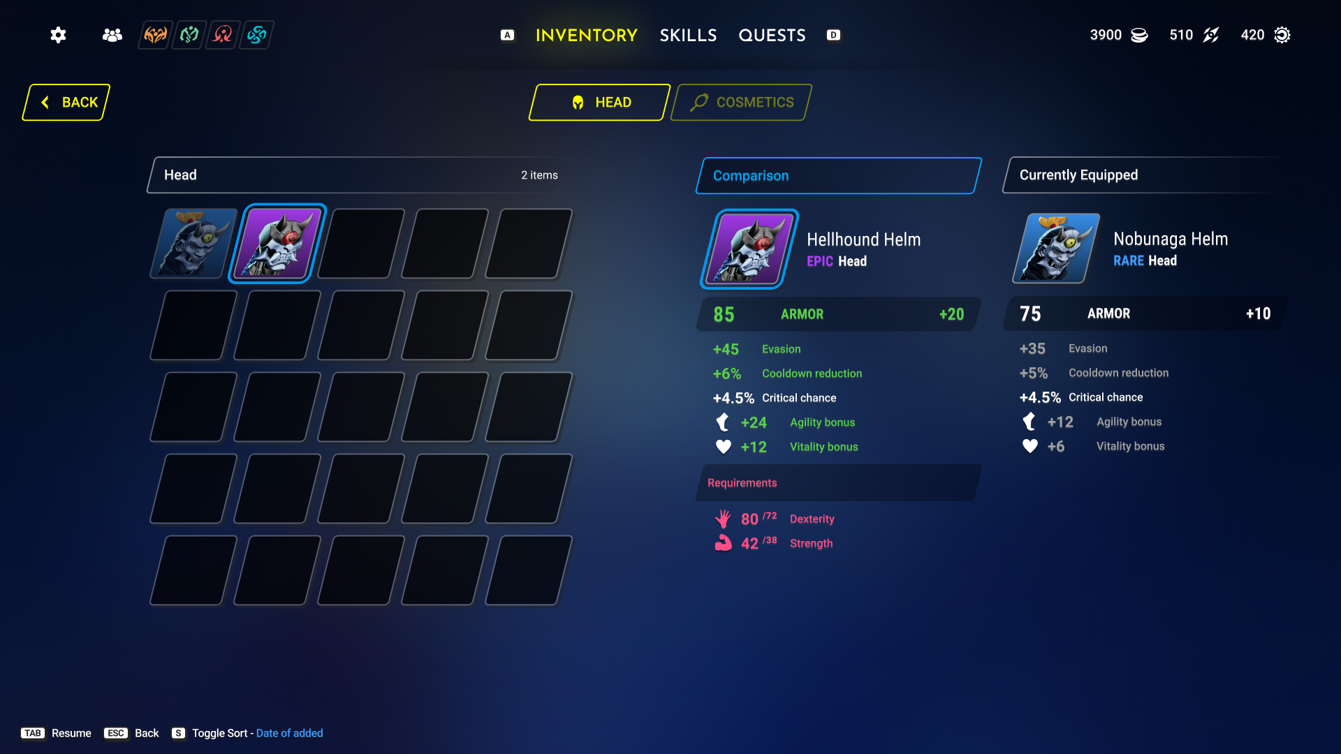
Head armor comparison screen
Head armorConsistent comparison UI for all gear.
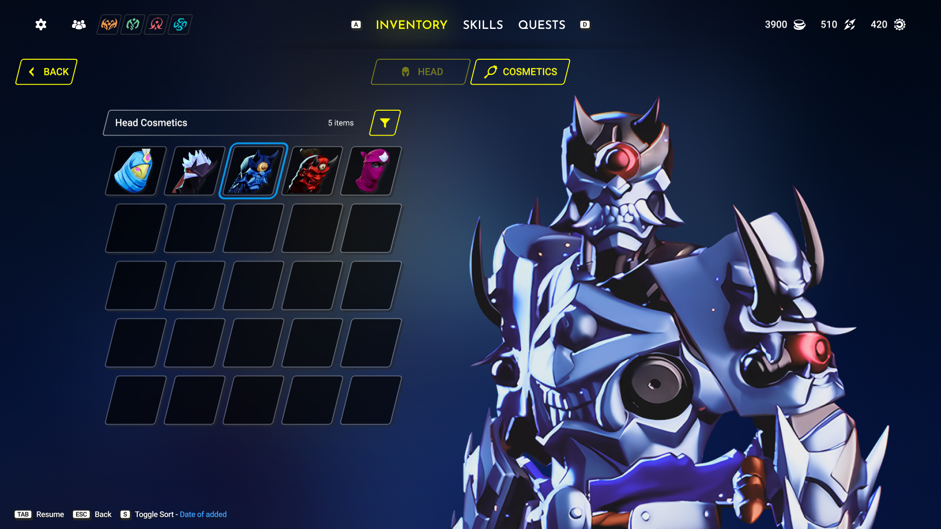
Head cosmetics grid with full-body character preview
Head cosmeticsCosmetics separated from functional gear entirely, with a large preview so the choice is visual first.
—

Item Icons

Consumables, gems, gears, and equipment icons were modeled and rendered from scratch in Blender.

Row of hand-modeled potion and gem icons, set A
Row of hand-modeled potion and gem icons, set B
Row of hand-modeled ring and gem icons, set C
III.

Progression

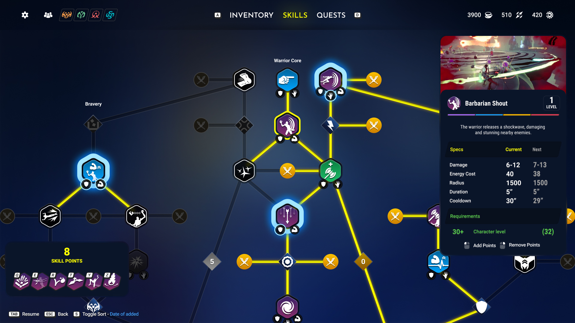
A branching skill tree where node state reads at a glance: unlocked nodes are colored, locked-but-available nodes are colorless, and not-yet-reachable nodes are greyed out — no reliance on a legend to parse the tree. Highlighted tracks tie each branch together for even easier reading. The active-skill detail panel shows current vs. next-rank specs side by side, so upgrading is a comparison, not a guess.

Branching skill tree with a selected skill's specs and level requirement shown
Skill treeNamed branches (Bravery, Warrior Core) give players a mental map of build identity, not just a maze of nodes. The right panel spells out current vs. next stats for whatever's selected.
IV.

Quests

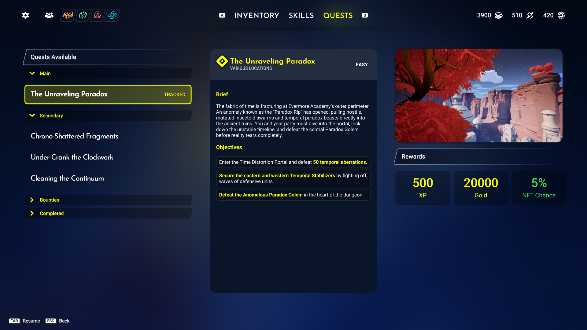
Quests are grouped by type (Main, Secondary, Bounties, Completed) with a single tracked quest pinned at the top. The detail panel always shows the same three things in the same order — brief, objectives, rewards — so a player scanning quickly always knows where to look for "what do I get."

Quest log showing brief, objectives, and reward breakdown for a tracked main quest
Quest logObjectives are listed in completion order and rewards are broken into XP, gold, and drop chance — giving the player a reason to weigh a quest before starting it.
V.

Crafting

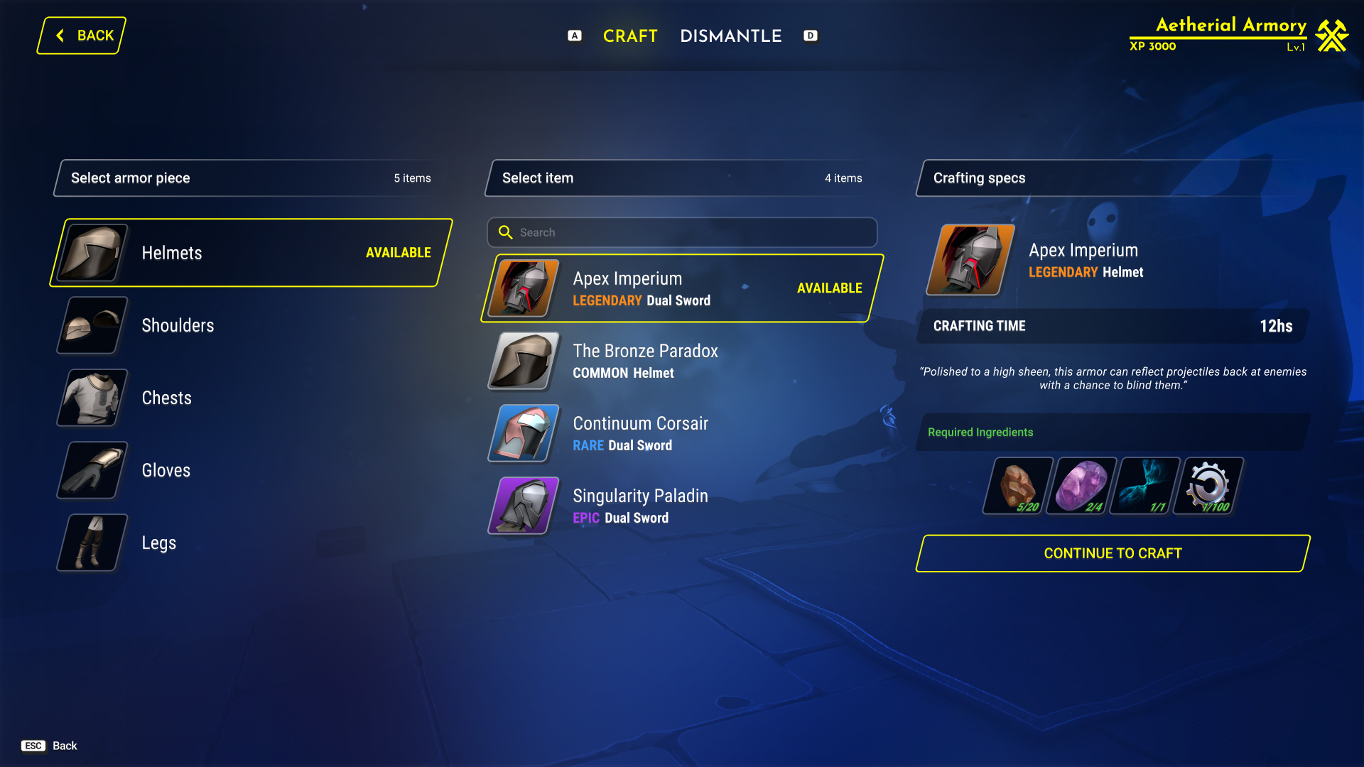
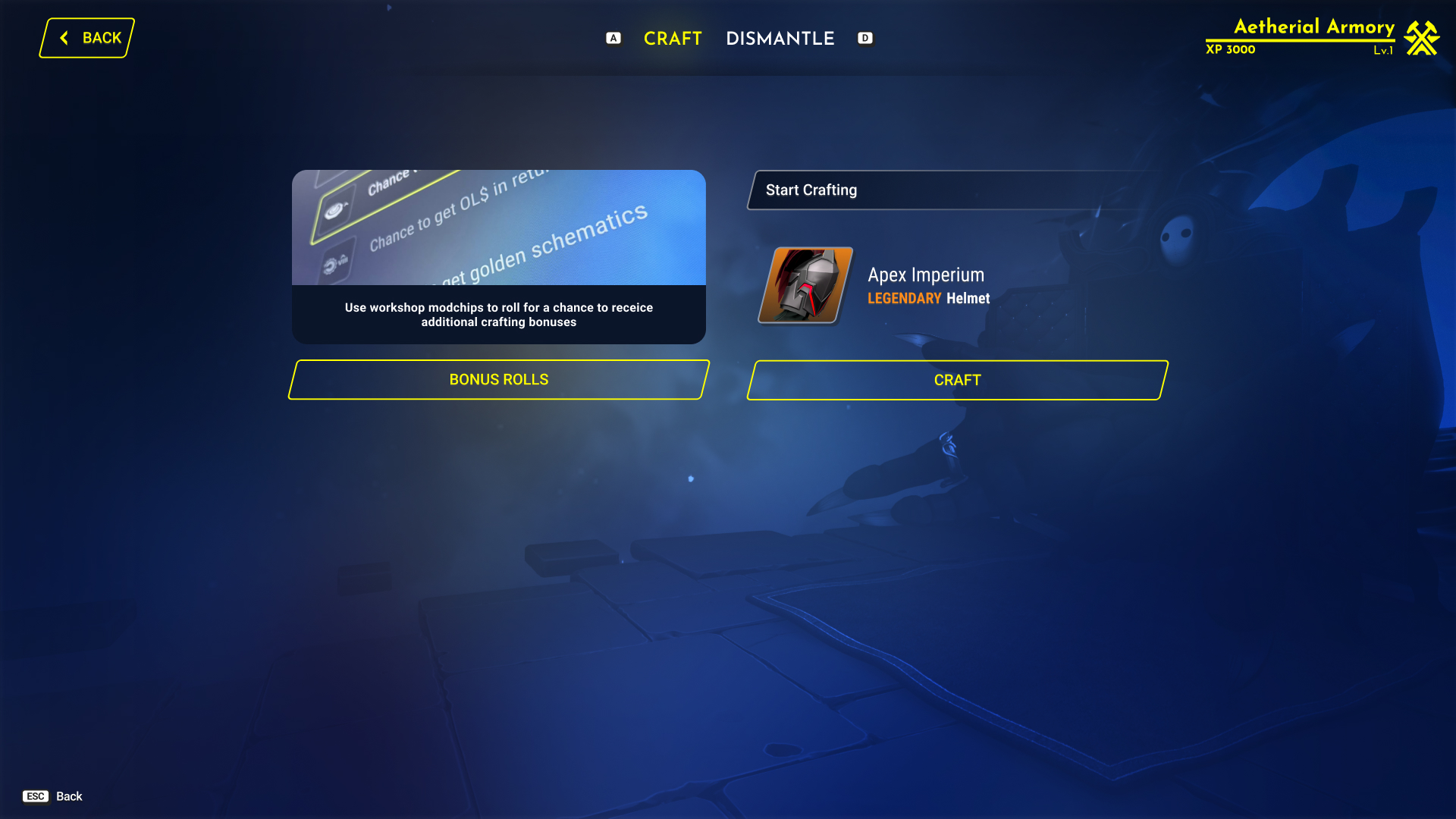
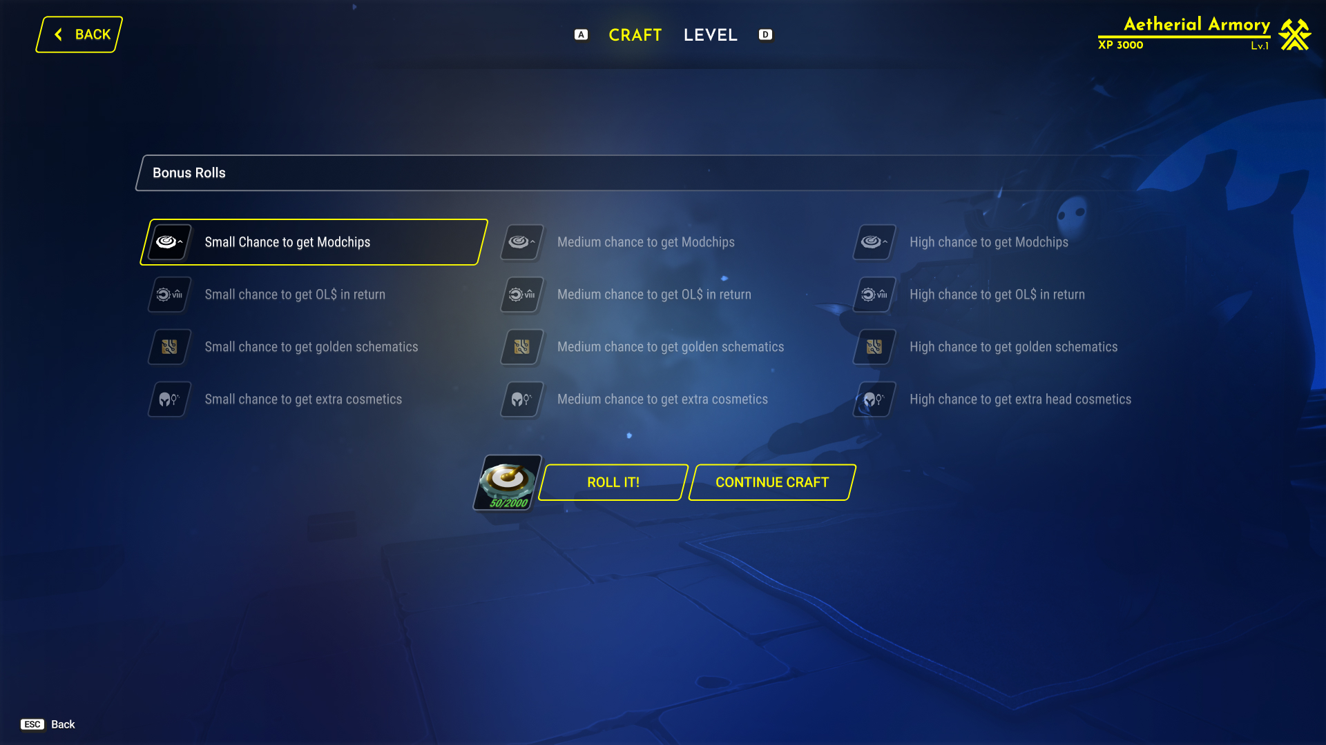
The crafting flow breaks a single decision into three legible steps — pick the category, pick the item, confirm the cost — before committing a player to a real-time craft timer. Bonus Rolls sit as an optional side-system: spend extra currency for better odds, entirely separate from the core recipe.

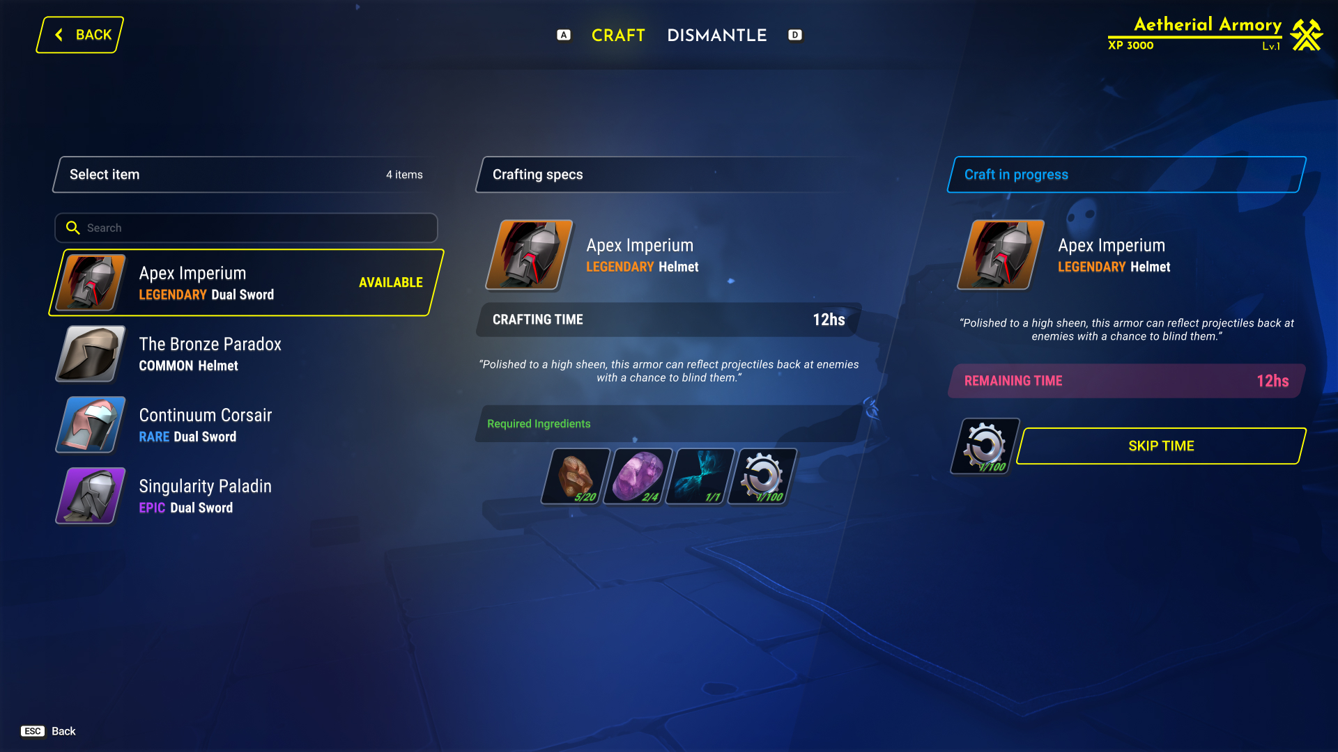
Crafting specs screen showing ingredients and a continue to craft button
Crafting specsIngredients shown with current/required counts before the player can commit — no surprise shortfalls at the confirm step.
Crafting process
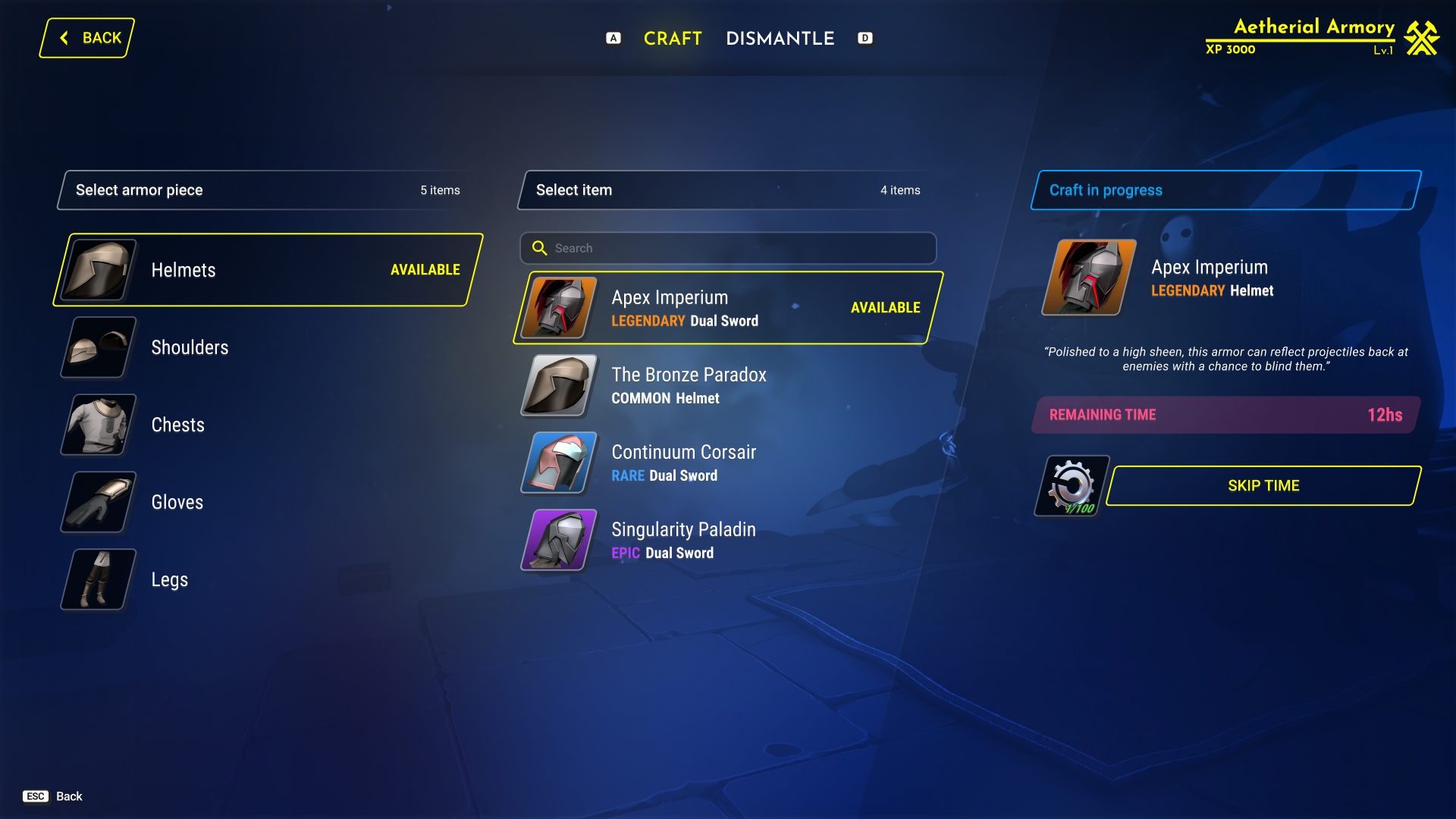
Armor piece and item selection screen in the Armory
Bonus rolls or craft?An optional choice to enhance your craft is presented here.
Bonus rolls screen with small, medium, and high tiers for modchips, currency, schematics, and cosmetics
Bonus rollsHere the player has a chance to improve their odds by spending some currency, and can continue to the craft as well.
Craft in progress
Craft in progress screen with remaining time and skip time option
Craft in progressA visible countdown plus a "skip time" currency sink — the monetization hook is transparent, not hidden.
Craft in progress alternate view with item flavor text
Craft in progress navThis shows that you can still navigate the screen while crafting, even with limited space.
VI.

Vendor

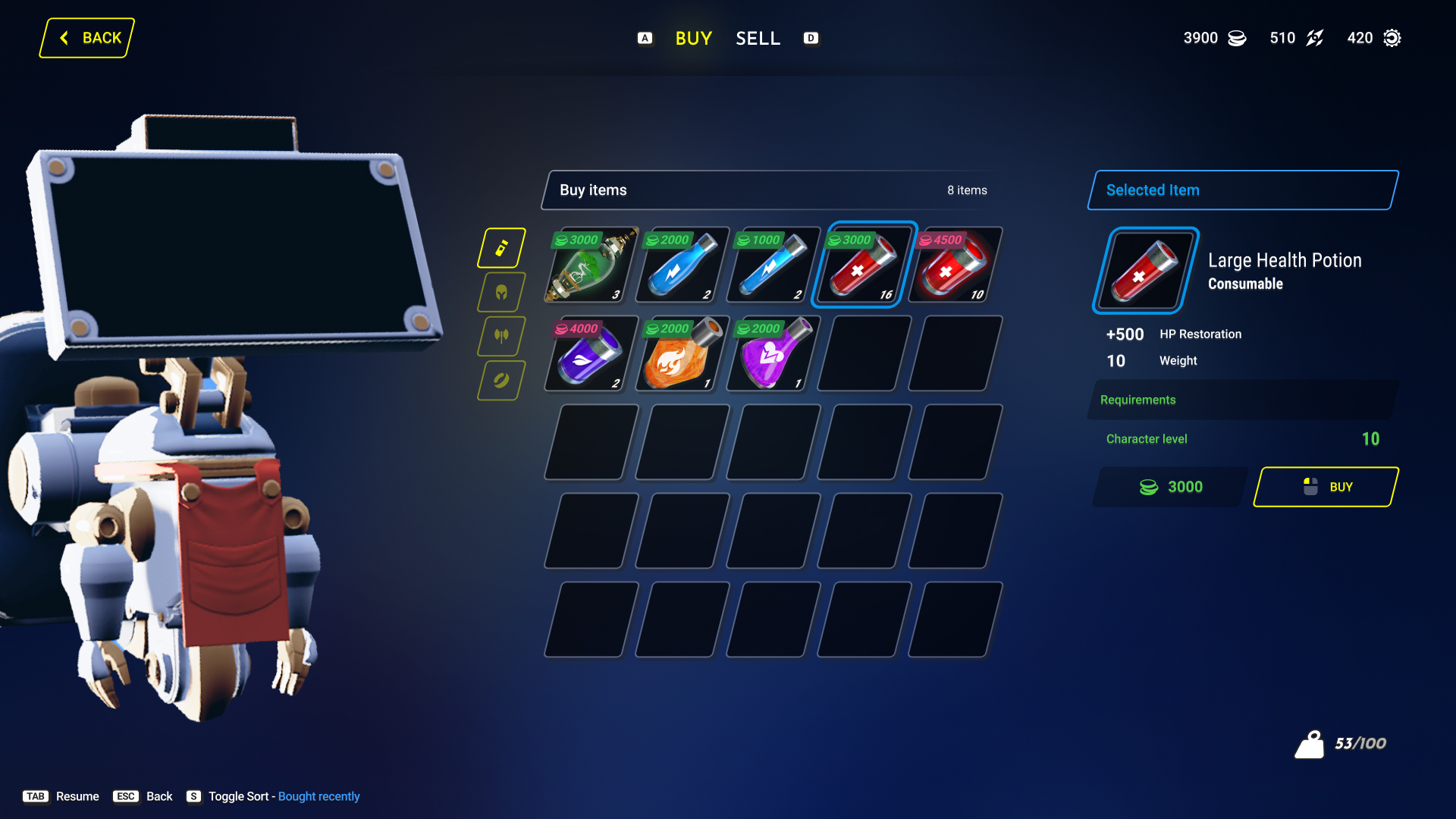
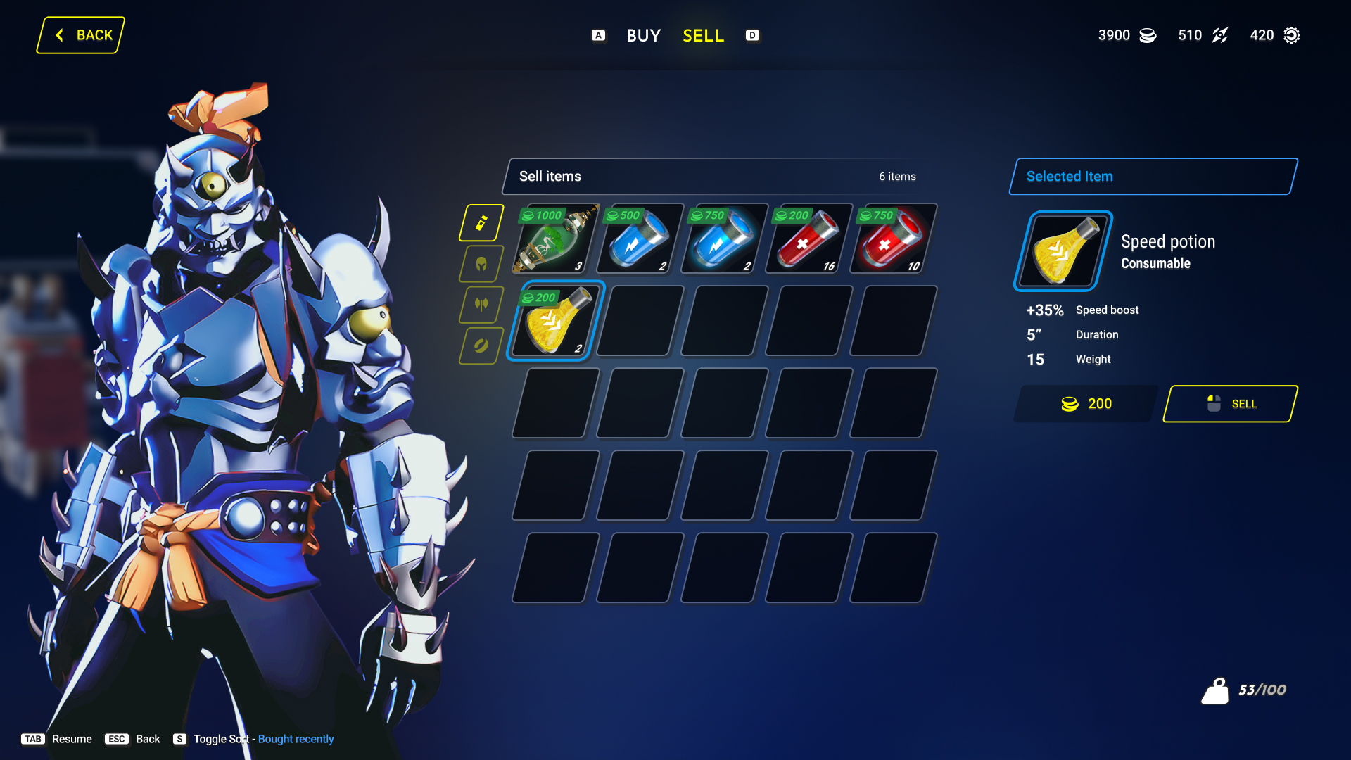
Buying and selling share the same three-column browse/detail/action layout used everywhere else in the shell — a player who's learned any other screen in the game has already learned this one, just with a tab switch between the two directions.

Vendor buy screen with consumables grid and selected item panel
BuySame three-column browse/detail/action pattern as inventory — a player who's learned one screen has learned most of the game's shell.
Vendor sell screen mirroring the buy layout
SellSell mirrors Buy exactly — tab switch only, no layout relearning required.
VII.

World Customization

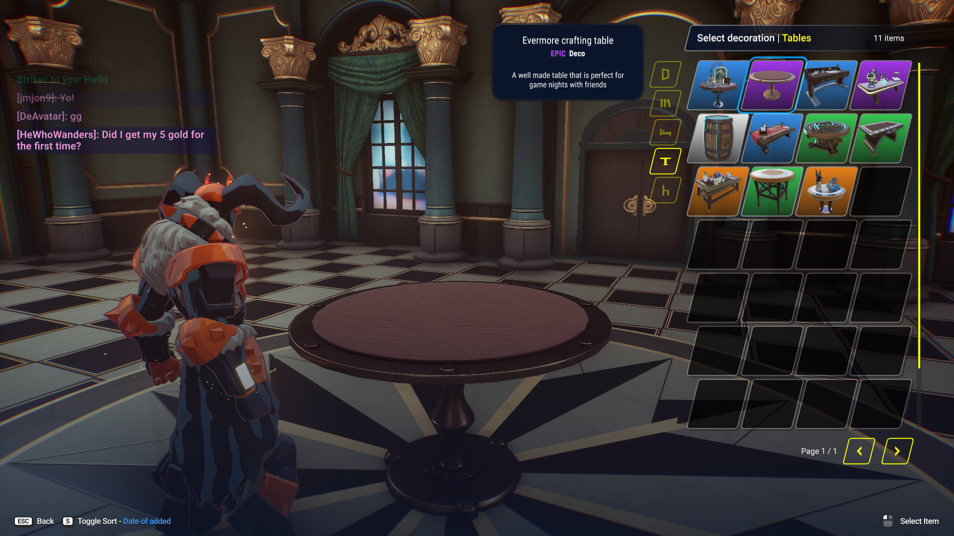
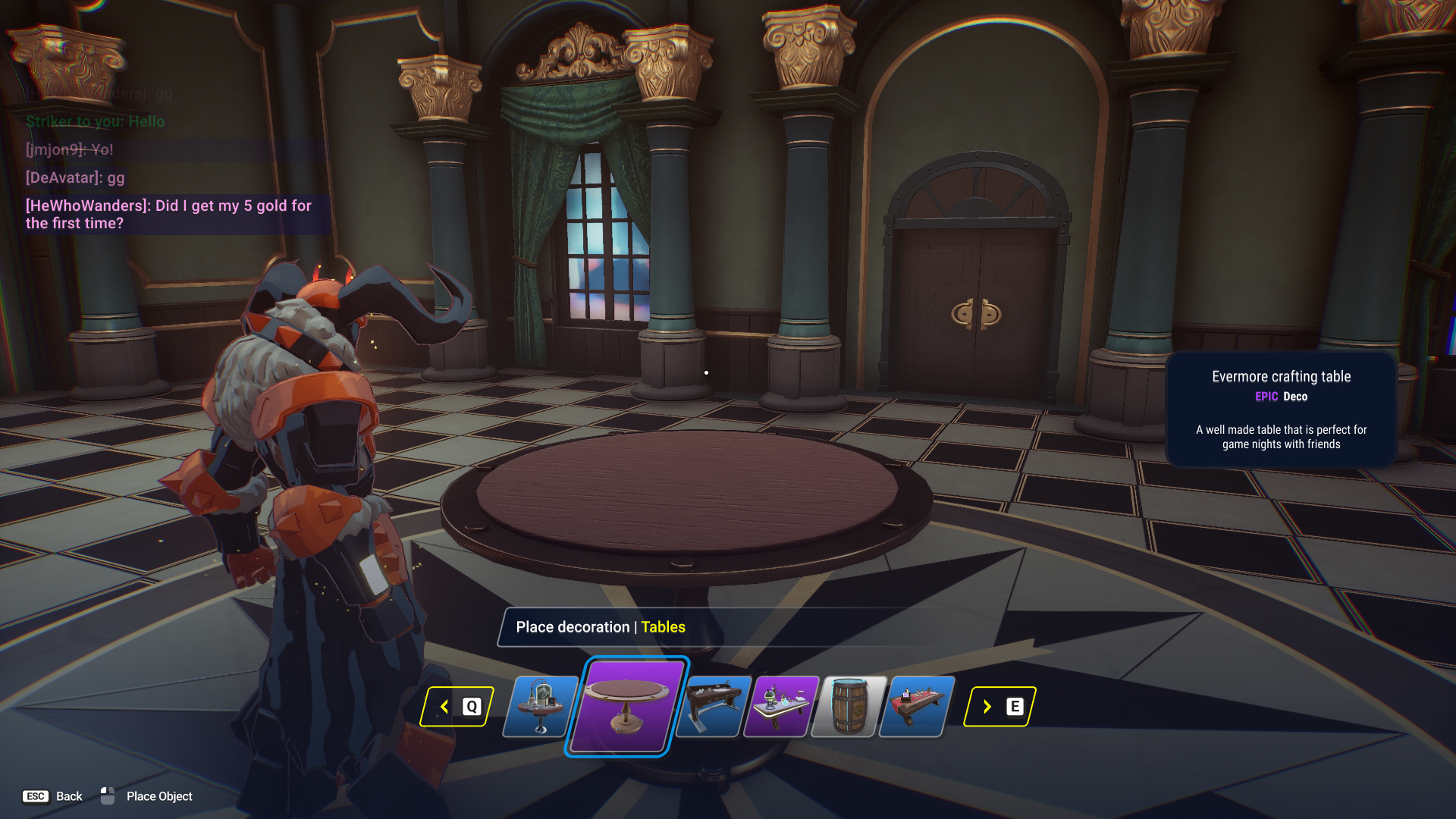
Placing a decoration keeps the world visible behind the picker — rarity, category, and deco text sit in a callout without ever pausing or fading the 3D scene, so the player can see exactly where the object will land before confirming.

Decoration inventory panel expanded over the game world
Deco searchThe full catalog opens as an overlay, sorted by category tab, without leaving the placement scene.
Final table placement confirmation in the game world
Deco placementThe object is already rendered at full fidelity in the world before the player commits — no abstract placeholder.
VIII.

Supporting Systems

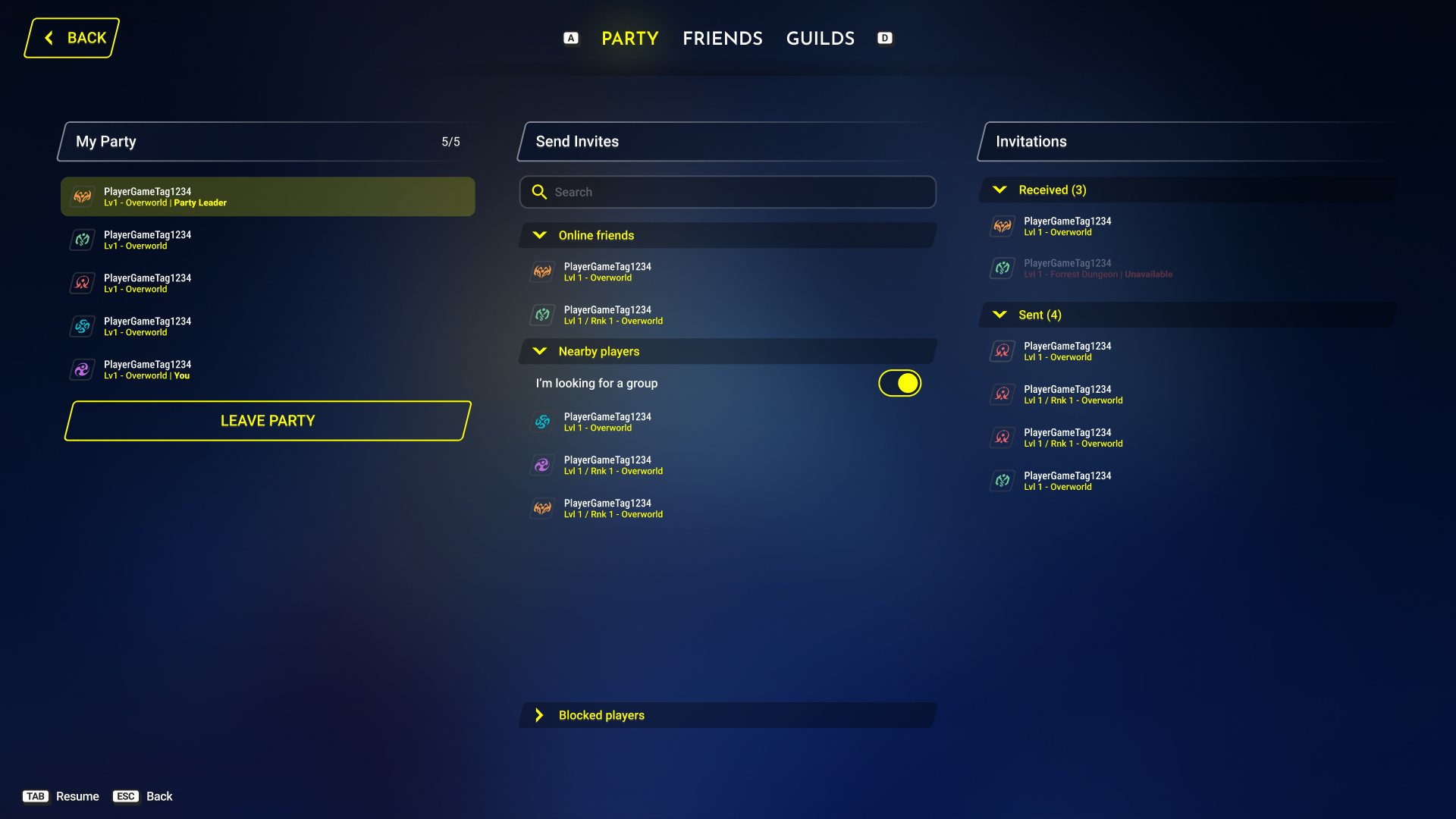
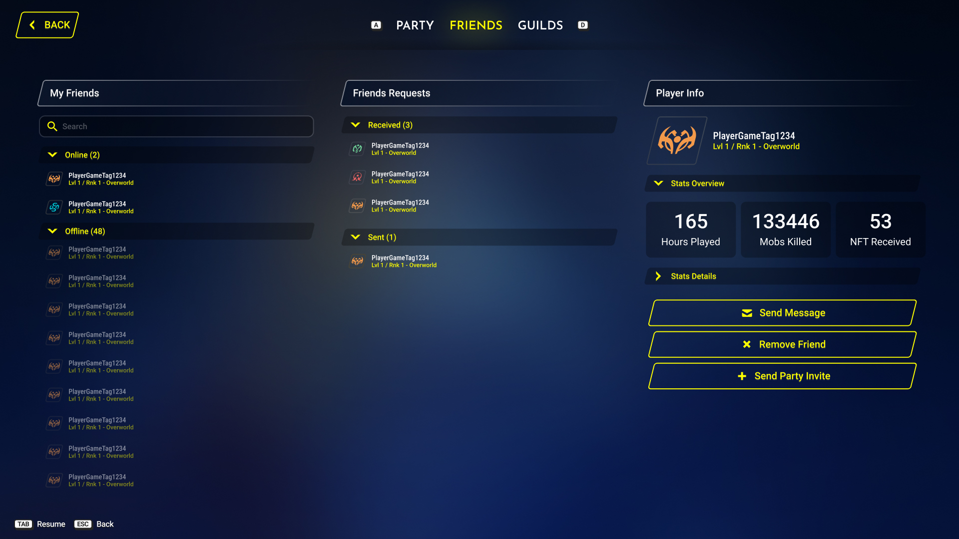
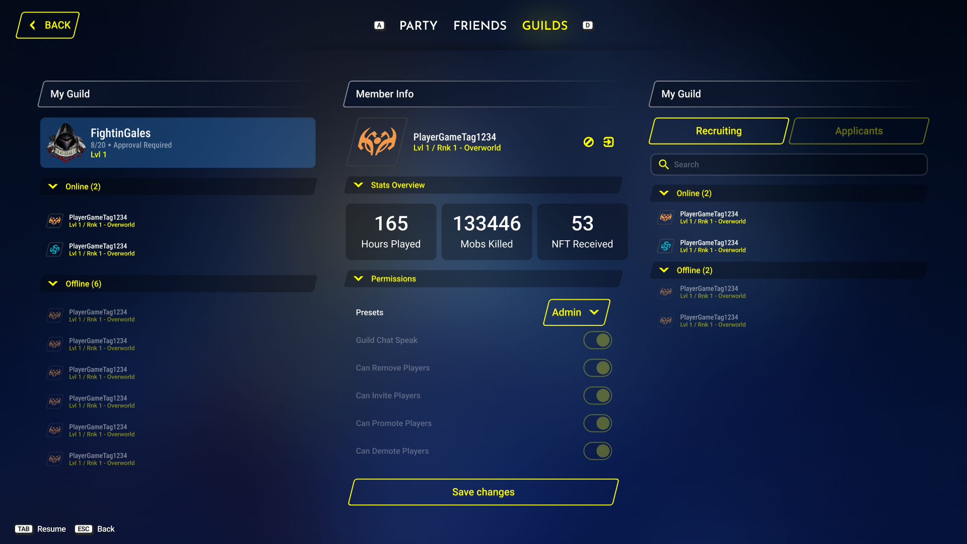
The shell around the game: config and social. None of it is glamorous, but a group-focused RPG lives or dies on how easy this layer is to use.

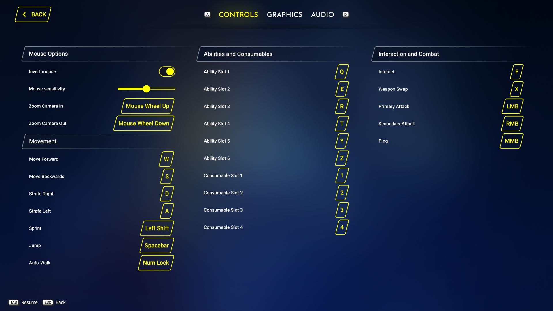
Rebindable controls screen grouped by mouse options, movement, abilities, and combat
ControlsGrouped by function rather than listed alphabetically — movement, abilities, and combat each get their own column.
Party screen showing current party, invite search, and pending invitations
PartyCurrent party, invite search, and pending invitations live side by side — no tab-switching to build a group.
Friends list with online and offline groupings and a player stat overview panel
FriendsOnline friends surface above offline ones automatically; selecting anyone shows their stat overview without opening a separate profile screen.
Guild management screen with member list and permission toggles
GuildsRole permissions are exposed as individual toggles rather than locked to fixed ranks — a guild can shape its own hierarchy.
—

What this demonstrates

The throughline is pattern reuse, not novelty: the same three-column browse/detail/action layout runs through Inventory, Weapons, and the Vendor; rarity is color-coded identically everywhere; skill nodes read their state through fill alone. Learn one screen and you've learned most of the game's shell — so new systems layer onto a vocabulary the player already has, instead of teaching a new one.

Next projects